Welcome to our new brand identity
Given our decision to enter emerging markets in the coming years, our brand transformation is essential to achieve our goal of helping our customers compete in the digital economy. There is no better time than the present to implement a clear, long-term plan that will help us to consciously evolve into a more unified, visionary, and customer-centric organisation.
The new brand platform reflects Kyocera Document Solutions’ commitment to continuously evolve into a more unified and customer-centric organisation. It reflects our goal of playing a vital role in helping our customers compete in the digital economy.
And it expresses the organisation’s growing dedication to helping our clients manage an immense volume of document information, finding insight and gaining agility, to optimise their business operations.
Put knowledge to work
The core idea behind Kyocera Document Solutions’ new brand identity is “Put knowledge to work.” The new brand concept expresses our priority on unifying our global resources in talent and technology to integrate hardware, software and service solutions to help our clients maximise their business potential.
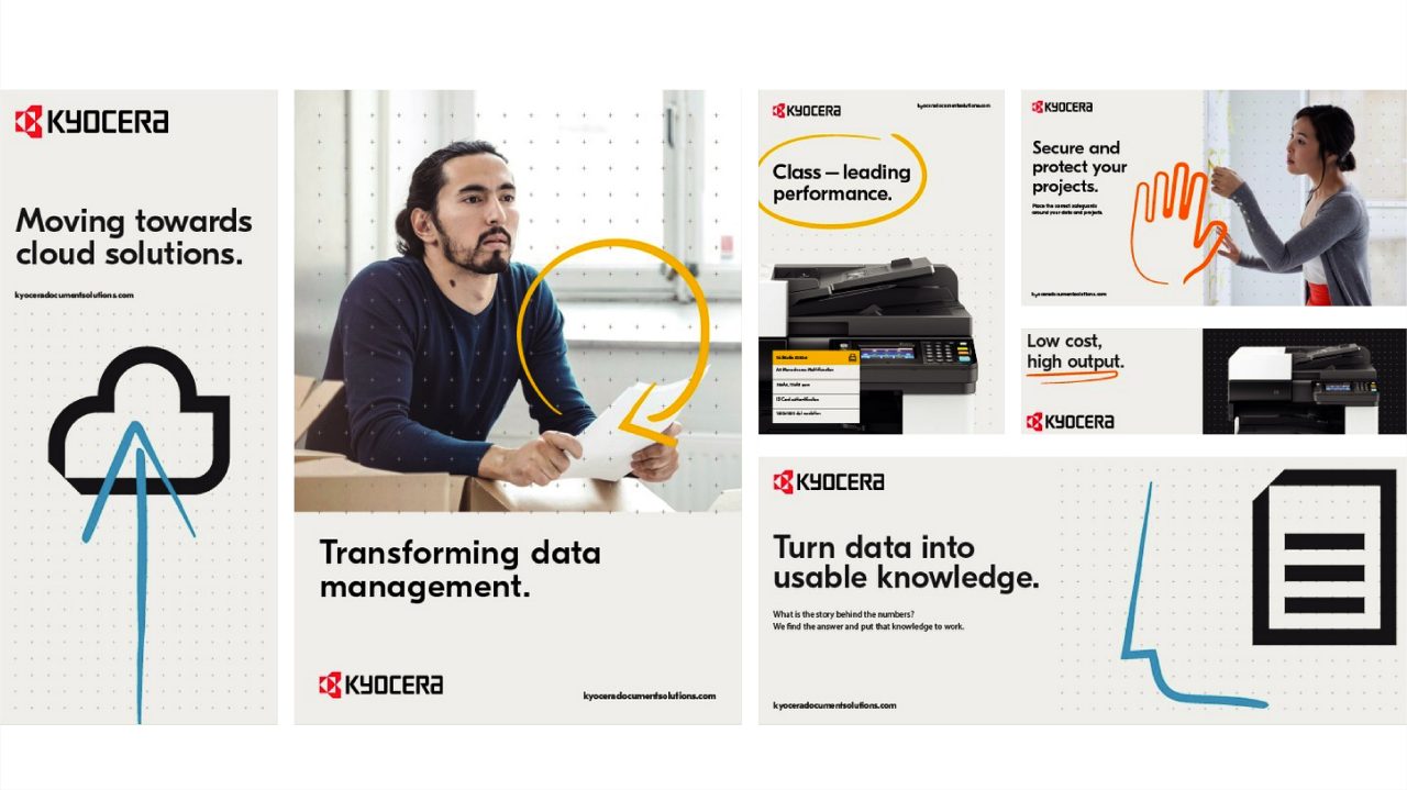
As it has since its founding, Kyocera places people at the heart of its values and objectives. A comprehensive set of communication tools, including a bold new colour palette, unique graphic icons and visual gestures in a handwritten style have been created to capture both the human and technological resources that come together to yield excellence in the design of total document solutions.
Kyocera's brand journey
Kyocera Document Solutions refreshes its global brand identity
Understanding our new visual identity
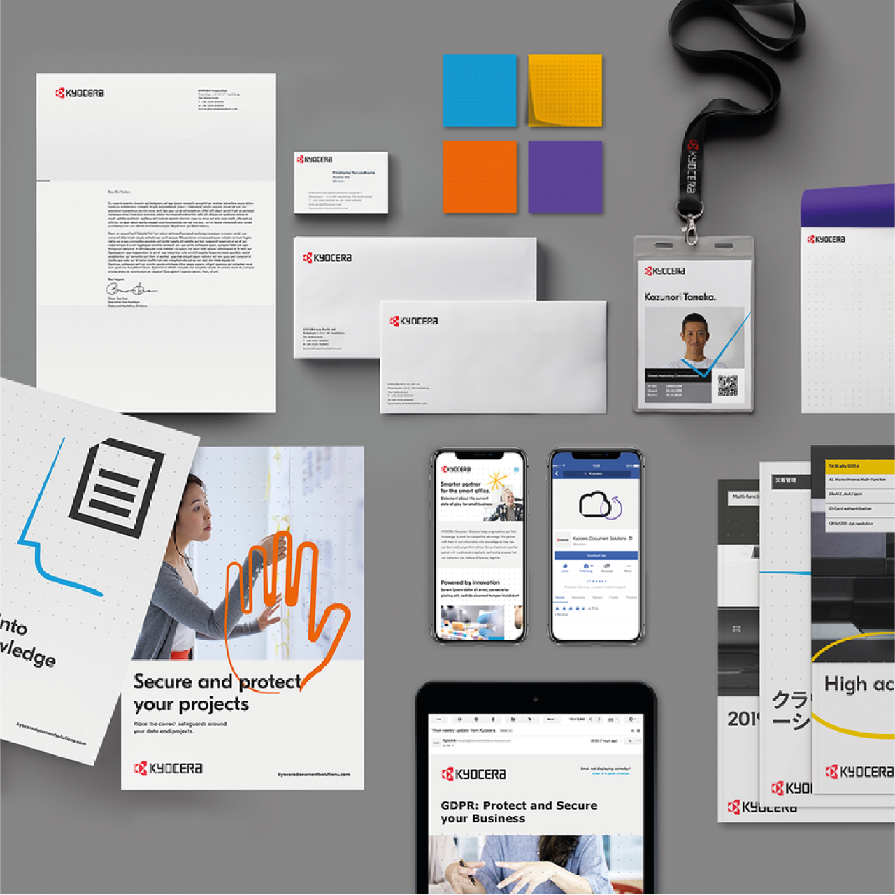
Our new visual language is based around a set of unique assets which come together to create a fresh and forward-looking identity for Kyocera Document Solutions.
Every asset of the new visual identity plays an important role for the brand, and using them in the correct manner guarantees consistency and unity for an enhanced user experience on a global scale.
Base Pattern
The base pattern grid is a key component of the Kyocera Document Solutions identity, appearing on all print and digital media. This visual asset represents the omnipresence of the information that is captured and managed by Kyocera Document Solutions. All of the other assets are designed to integrate perfectly with the base pattern.
Colour palette
Our revamped colour palette consists of a primary palette — to compliment the classic Kyocera Red — and a colourful secondary palette. The supporting palette has been created to add depth to our visual expression and function as a highlighting tool.
Our typography
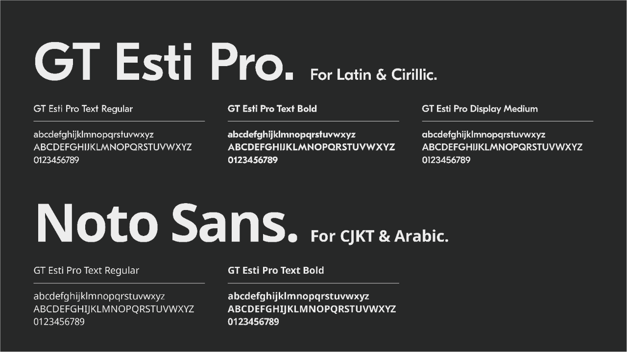
The Kyocera Document Solutions typography includes two typefaces: GT Eesti Pro for Latin alphabets and Noto Sans for non-Latin alphabets. We selected these fonts for their modern feel and typographic similarities. Ultimately, we want to ensure our communications are consistent in every language, creating a powerful and unified voice across all of our markets around the globe.
Hand-drawn gestures
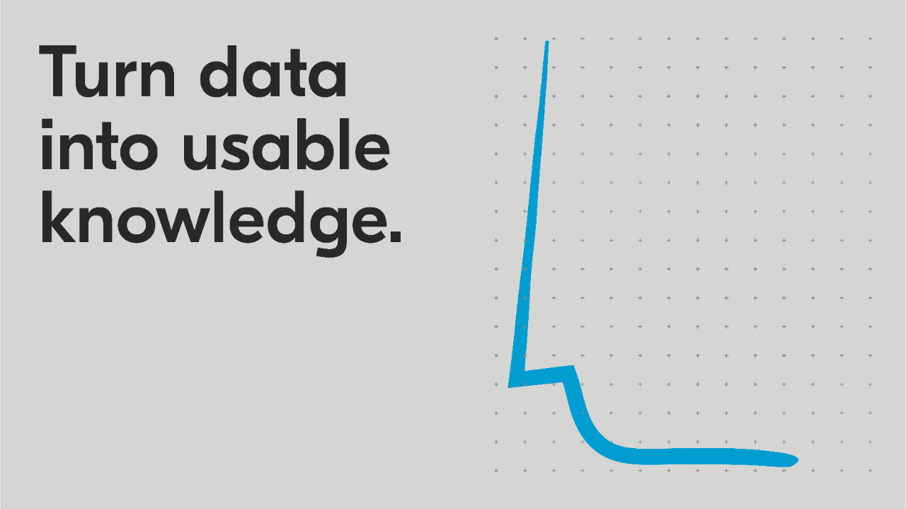
Gestures are one of the most innovative additions to the Kyocera Document Solutions brand. They are a powerful element designed to be used in combination with the rest. These gestures are hand drawn to give our communications a final human touch and reflect Kyocera’s sincere desire to make a positive contribution to people’s lives.
Icon set
We have developed a library of icons that are unique to the company. Each one is inspired by characteristics of the Kyocera brand. They are meant to be used as shorthand for specific technology, for example cloud solutions, or as elements within information design.

Press Release - Kyocera Document Solutions refreshes its global brand identity
The new brand identity reflects Kyocera Document Solutions’ increasing role in helping clients to capture the opportunities of the world’s digital economy. It reflects the company’s growing dedication to helping clients manage an immense volume of document information, finding insight and gaining agility, to optimise their operations.
